Am I the only one bothered by the current state of the Audio Mixer in MC7?
In the ABVB era, we also had a v7 that would allow us to vertically resize the mixer, thereby enlarging or shrinking the length of the faders, for more/less detailed fader control.
Until a few years ago, we had two different Tool windows for the Audio Mixer (clip levels) and Automation Gain (volume automation). Because they were two different tools, they had their own Tool menu entry, and you could map them, and call up either the Audio Mixer (for clip levels) or the Auto Gain (for volume automation), and you could even have them open at the same time. At some point, the Live mixer mode was added. I am unsure about the percentage of folks ever using the Live mixer, but it must be extremely small, as I've never encountered anyone who has ever used it. But having the feature there would not matter, if we were not forced to switch through the Live mode when toggling between Clip and Auto mode (Clip->Auto->Live->Clip->Auto->Live, etc.). It makes no sense that A. we cannot skip through the Live Mixer and B. we cannot map any of the mixers – we MUST use the mouse to click the switch button in the Audio Mixer. And neither the Record button nor the Clip/Auto/Live modes can be accessed from the Avid Artist Mix.
At some point we got the UI option to select a 4-ch, 8-ch or 16ch mixer. In 6.5, clicking the 8-track or 16-track mixer would auto-resize the Mixer so you could actually access the tracks you just said you need. In v7, you have to manually maximize the window, otherwise it stays the same size, but scroll bars are added. 
To me, that makes no sense, as I then still need to scroll to the tracks I want access to, or I need to click the maximize button first. If I wanted the window to stay the same size, but access A12, I'd simply toggle the Grp1/2/3 button, wouldn't I?
And, worse, if I maximize the 16ch mixer on my Mac, this is what I get (notice the black space in that window to the right: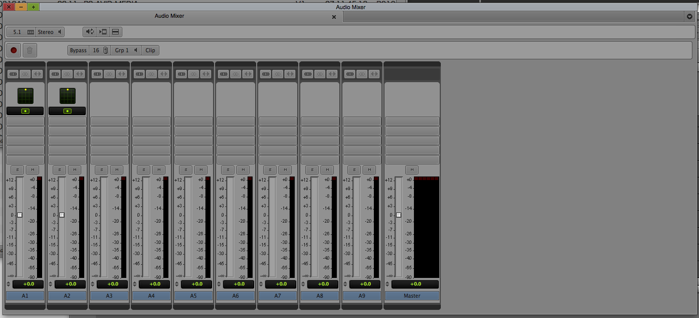
And here's what happens if you go from a maximized 8ch window to a 4ch mixer (note the useless blank space to the right: 
The same issue applies when you go from 16ch to 4ch mode, which leaves you with a 75% blank window. Or if you are in 8ch mode for your timeline, then switch to your Source monitor: you will have a large blank canvas with just two faders on it. Not efficient, and far from goodlooking.
Why would anyone want that window to become or stay that size and eat away screen real estate?
This also applies if you are in 4ch mode and open a Surround Panner. Why on earth would that not show you the entire Surround panning window? How is that helpful? Note that you can barely see and use the 'Close' button to the right of the Clip button:
 This just won't fit in the window it opens in.
Looks like bad UI design, but it has been suggested to me that this is actually by popular demand – which would astonish me. I'm starting to think that product developers have misunderstood the complaints about the huge mixer and have enabled this weird behavior as a new feature.
Also, I'd much prefer a clearer visual difference between Clip mode and Auto Mode. I sometimes hit the record button (which doesn't even need to be there in Clip mode as it is without function) only to realize I'm not in Auto mode.
Anyone else care to chime in?